
Font type and font weight
A key element of LUH’s image is the Rotis Sans Serif font. The Rotis font family was developed in 1989 by Otl Aicher, a designer who was also responsible for the look and feel of the 1972 Olympic Games and Lufthansa. This distinctive sans serif font is characterised by its good legibility and thoughtful formal design.
The following font weights are used as part of Leibniz University Hannover’s corporate design: Rotis Sans Serif Light is the basis font and is used for all informational and body texts, on letter head and in brochures. Rotis Sans Serif Bold is used for emphasis and for headings.
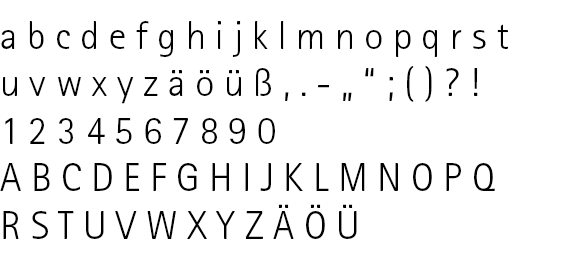
Rotis Sans Serif Light (basis font)
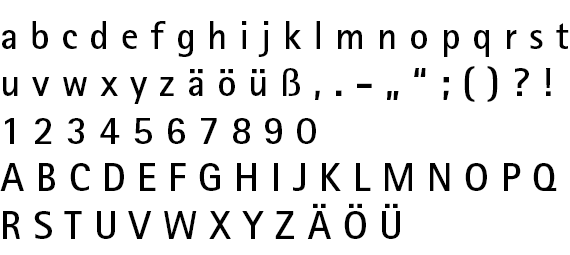
Rotis Sans Serif Bold (headings, etc.)
Substitute font
Use of the Arial font is permitted for internal communication in exceptional cases only. A mixture of Arial and Rotis Sans Serif is not permitted. The consistent use of Rotis Sans Serif as a unified house font ensures the quality of Leibniz University Hannover’s corporate design.
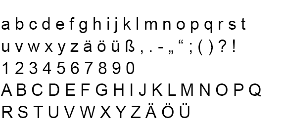
Arial regular
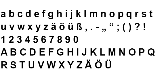
Arial bold
The choice of font size is based on the type of item to be printed or the size of the digital document. Detailed information about font sizes and tips for using them is provided with the various templates in the downloads section.